[Music]
Abby: Welcome to Matters of Experience, a podcast produced by Lorem Ipsum, an experience design company headquartered in New York City. Our podcast explores the creativity, innovation and psychology driving designed experiences and encounters. If you’re new, a hearty, warm welcome. And to our regular listeners, thank you for tuning in and supporting our conversation. My name is Abigail Honor.
Brenda: And this is Brenda Cowan.
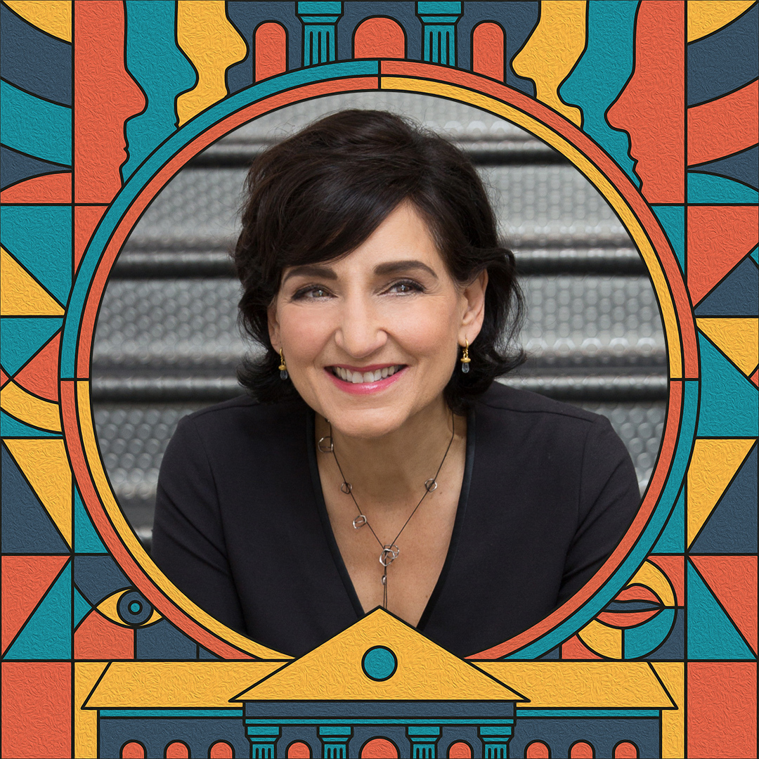
Abby: So today, Brenda, we’re discussing all things color, from bright and attention seeking to muted and quiet. We’re going to be looking at how color affects us and how we can design with it for specific outcomes. Today’s guest is synonymous for me with the word color. It’s my pleasure to give a big, bright sunshine orange welcome to Laura Guido-Clark. Laura, welcome to the show.
Laura: Thank you so much. I’m so honored to be here and to share your color enthusiasm.
Abby: So, Laura, you launched a groundbreaking color methodology back in 2017, it’s called LOVE GOOD COLOR, that uses science and the senses to help designers factor in emotive responses when using color, and through your work, you empower organizations to strategically shift their approach to designing through color for deep impact. You’ve applied this methodology to your work with companies like Herman Miller, HP, Samsung, and Toyota, and we’re really excited today to learn how color can be a change agent and how to design with it successfully.
Brenda: Before we dive deeply into the world of design, Abby and I always love with all of our guests to get a sense of your journey, the origin story, if you will. How does one wind their way into the world of color?
Laura: When I was ten, I saw The Wizard of Oz, and I always say that when Dorothy stepped into the Technicolor world, I went with Dorothy. I never came back from Oz, and it was so striking to me, the world she left, the sepia color world, to Oz, and Oz just represented hope and opportunity. And it was really the first time that I ever noticed that color was powerful like that, and I somehow felt it was going to play a role in my world. I just didn’t know how.
Brenda: Oh my gosh. Wow.
Laura: Yeah.
Abby: So, what was your background? So, you’ve obviously always had a passion for color, but can you talk to us about your background and sort of how you balanced design with your other interests?
Laura: Yeah. Well, honestly, I was really torn between being a doctor or a designer. So, I was in pre-med and in interior design, and I was getting ready to apply to medical school. And I had a couple more classes in organic chemistry and I remember having this epiphany that I didn’t want to be a doctor and that I really needed to do design, and I got up and I turned in all my lab equipment, and my lab partners were going crazy, like, you’re, this is just a moment. You, don’t, you’re going to regret this. I said, I’ve never been clearer in my whole life. And I turned in my lab equipment, and I’ve never, ever regretted the decision.
Brenda: Wow. Well, I’m going to not ask what your folks perhaps might have thought about this moment. Or anybody else.
Laura: It took me three months to tell them.
Brenda: Oh. But I think it’s really fascinating. And I’m going to wager a guess here that there’s a definite link between your background in the sciences and the fundamentals of color. Can you tell us a little bit about what is it that people are responding to when they respond to color? How does this work?
Laura: Well, I think one of the things that’s most fascinating about color is not only the science of it, but the association it has with language. I believe it is another language, that actually color can tell stories that sometimes words can’t possibly tell. And if you notice, if you walk into a room, no one has to give you a cue about how you’re feeling.
Color many times is signaling all of those things. And it could be a memory, a color memory. It could be just the way that it perhaps evokes nature. But color is speaking to us all the time. And I think that that’s what really drew me to it, because it was a way of communicating that sometimes I found we weren’t able to say those things with words.
And the way that color works, I mean, it’s a wavelength. Not only do you see it, you feel it. And that is a really powerful thing. And they have done studies where sighted as well as blind students can have a like effect, because color is a wavelength. And I think that that’s another part of color that, that makes me feel that it’s a tool that’s often underutilized or perhaps sometimes thought of as only on the surface. And yet it is really the heart, the heart of the matter. Right?
Brenda: Wow. Absolutely. Now, we would be remiss not to give a nod to folks with color blindness.
Abby; Yeah, that’s, that’s completely true. So, my mom is actually colorblind, and my daughter is colorblind, too. So, I live with that awareness in all its shapes and forms. But it really does, it’s a big part of their experience with the world. So, do you work in any way with an awareness that different people experience color in different ways? And my second question, which is a toughie, do you think that in general, we’re, we’re all born to appreciate color.
Laura: I always take into consideration color blindness. We run our colors through the app, so we understand what people who are colorblind are seeing. I’ve met the person who worked on the EnChroma glasses, which can correct color blindness and seeing how powerful that really is. And my father was colorblind, which I didn’t really realize. I just thought that he was super organized and that my mom just like, wrote the colors of his socks and organized his drawers.
I thought, wow, this is something, wow, like she’s super organized. But then I realized he couldn’t see in color. And the other part of color is that we are all still seeing color a little bit differently, and all the way we see it on our screens, our screens are calibrated differently. And also, the way we respond to color is different culturally.
And we also, I think, have a way of thinking about color through color memories. Color memories don’t go away. So, when you’re working with a client, you really have to take into consideration if they’ve had not a good experience with a certain color and from what I heard, I think Zuckerberg is colorblind, and that’s, he picked the color of Facebook because it was a color he could see.
Brenda: So, my husband is a digital retoucher, and so everything that he does is about color and is about understanding color and how color builds shape and volume and dynamic and everything else. And so, in the work that he does now, mostly for ad agencies, he’s constantly sculpting with color, and it’s amazing to me how his clients, how hard it is for them to really kind of understand the complexity of working with color. He does a lot of skin, skin tones, and I hear him all the time talking with his clients, just saying, you’ve got to trust me if this is not perfect, if this is not done incredibly well, they will see that it’s fake.
Abby: Well, just jumping on the skin, Laura, you know, we were chatting about how we can read subtle fluctuations in our skin, right? There’s a whole science.
Laura: Yeah, well, that’s one of the things that Changizi discovered, he was a neurobiologist, and he found that the reason why we seeing color is to read human emotion, and that we as humans can read the subtle fluctuation of hemoglobin on our skin and primates who have less hair on their face, the rods and cones in their eyes are shaped more like ours, so they can read those too. And to your point earlier, I believe that we are very pure and recognize color, colorblindness or not, that there’s a way that color still moves us in the world and that we all know more than we give ourselves credit for. But I believe what happens, like with children’s art, judgment comes in the way, and we fear we’re going to do it wrong. And so, we play less and less with color and become safer when we really need to be using it as a powerful tool to support the intentions of space or product or whatever it is we’re doing.
Abby: As ever, just another side note, as we grow up, we seem to just sanitize ourselves and our creativity and our play. I have no idea why and we fight constantly against that. I know Brenda and I both try to channel our inner—
Brenda: Child.
Abby: —child, and when we are designing. But you’re on a journey to change the world with color. What is it about the power of color that really captures your imagination and makes you think that you can make a change to the lives of people you design for?
Laura; I think that color represents a story. I think it represents our personal story, our personal longings, and I believe that it also represents our inner beauty projected on the exterior. So, I know that when I’m working in my nonprofit with children and they start to see these things that they’re creating come alive, it creates a greater sense of belonging because it is of them. It is done with them, and I believe it is part of their culture that they’re representing, part of their dreams and their journeys. I think it is, well, we call it optical optimism, but it’s a game changer.
Brenda: Wow, I absolutely love that. I love optical optimism. Laura, is there like a particular way that you find yourself bringing your clients into the world of color and help them kind of see all of the possibilities that are there?
Laura: One of the reasons why I developed the system was so that I could engage our clients in a way that is very respectful, and it asks questions of them that they know how to answer. So, when we sit down in sessions, we don’t ever start with color. We start with words and language. And so that becomes this process where they feel heard and they feel seen, just like the kids in the community.
And then we start to do this process of discovery, and then we can show them ways that color can be associated to their needs and their intentions. And then all of a sudden it becomes much more fun, and it doesn’t become something that’s, you know, this is what it is, and I know and you don’t know. It’s never those conversations.
It’s more like, oh, I see. So, you don’t like blues, well, let’s shift to the same feeling in something you do like, like a red. And I think that this is where the conversation becomes super rich and where alignment can come with the client and with your team.
Abby: What’s the process then, you mentioned you start with words. Can you talk us through like an example of a typical process with a new client?
Laura: Yeah. So, we, we need to understand who they are as a brand. And it might seem seemingly simple to boil down to, you know, 3 to 5 words who you are as a brand, but it could take hours or days to do that type of work. And then if we’re working on a building, it’s really understanding what each space is doing. What is it supporting? What do you want people to feel in that space? What are they doing in that space? And we use those as language-based cues.
And I think a good example of this is the way that we worked with Adobe and Gensler on the Adobe Founders Tower. We programmed every single space with LOVE GOOD COLOR. So, every single space we understood deeply the intention of the space and color was selected based on those needs. And all of a sudden it became so much easier. It was a puzzle that came together very seamlessly because we understood what it was, we were trying to say, communicate, and support.
And so that’s really how we work with our clients. And it could be a product. We work with the children in the schools that way. How do you want to feel when you come to school? You know, nobody asks them.
Abby: No. No. Environment, hugely underdeveloped and under spoken about in classrooms. My mom started as a classroom teacher and the first thing she had her kids do in September was transform the classroom into an environment, and whether it was a huge tree in the middle, whatever they wanted to, so that they felt ownership on their space and not like they were sitting in a cube with things on the wall.
Laura: I love your mother.
Brenda: Oh my gosh. Abby’s mother is incredible. Absolutely incredible. So why did you found Project Color Corps? This is your nonprofit organization that believes that color is a change agent and infuses a sense of well-being, joy, and interestingly, you talk about equity as it’s related to color and how it is brought into our surroundings. Can you tell us a little bit about some of the work that you have done?
Laura: I believe we’re on our, I think, 22nd project, and we’re now in four cities across the country, which is very exciting for us. But I think it’s very hard for a child to muster a sense of hope in hopeless settings. And what I find is that they’re often surprised that we would actually come and work on their spaces, which is very heartbreaking to me. Like, why would you want to do this for us?
So, what happens is that they begin to think that that is their value, which couldn’t be further from the truth. And what I realized about color is its humanistic qualities. And again, it’s a way for us to connect with one another. And so, using it, I saw how powerful it was for my clients. And I started wondering, like, how about all the people who don’t get that? And how could we go into these spaces and work with them so that they see themselves in their environments? And that’s the, really the whole point of it, is they see their inner strength and beauty every single day.
Brenda: Having hope in a place that is a significant part of your life, and that is such a significant part of your world, is so critical to the fundamental sense of well-being that a person needs, and it’s so important and so wonderful that you’re able to do this. Can you give us like, an example of one project that you can tell us about where you saw, maybe a real transformation or that really had, was there like a magic moment that you were able to witness or experience?
Laura: Yeah, I think that every project, I walk away feeling like I got the gift. I feel like I get way more than I give and let me just share with you our very first project, because it was the hardest one to get. You would think that people would want to sign up and say, oh, I want this to happen. And I kept thinking, do they think I want them to paint my house? Like nobody was volunteering. I’m like, I don’t understand this, but I don’t think people even understood that this was an option or an opportunity.
But the very first school we went into was called the E.C. Reemes Academy. It was—it was located in what was called the Killers’ Corridor of Oakland because the kids were in lockdown a few times a week from drive-by shootings. And when I went to the school to engage, our engagement is usually about a year long, they asked me why their neighborhood never got color and why they never got nature. And when I talked to them about their feelings and what they were hopeful for in their school, they said, do you think you could, you know, create a space that would make us feel respected? Could you create a space where people might want to come and visit us, because no one wants to visit us now?
And so, it was this really deep understanding of how they will not only hold themselves, but the environment around them. And it made me realize that as we went through this process that, you know, we’ve been told that disruptive behavior is actually reduced in our engagement. It’s giving a voice to the children and the community and letting them all along see that they are so powerful. And so, I think for me, it just reinforces that we don’t really give voice enough to children and communities, and we don’t, and we really underestimate neuroaesthetics and what a facility can do for learning, for growing, for many, many other things.
Abby: What’s really interesting about your story, though, Laura, is when you have a vision… I just want to talk about people in business or in nonprofit who have a vision for something that you know the community needs, and the difficulty you had to persuade the first person to adopt it. It’s hard, right? And it’s amazing because, you know, there’s a need and you have to sort of beat that door down or try to find that connection, that magnet that’ll set you off, because I’m sure after that first one, once you’ve got that first case study, the penny seems to drop for people. And they’re like, yes, we need you. Laura, come over here.
Laura: Yeah.
Abby: Why are human beings like that in the first place? Why was it so hard, you think, to find that first group?
Laura: I think because we don’t know what we don’t know. So, it was never, ever part of a conversation when we’re talking about education. It’s always thought of as something superfluous. It’s, isn’t that nice. And if you think about it, it’s not really taken into many school districts, nor is it really, you know, maybe in affluent communities, you see, there are beautiful schools, but typically it’s thought of as institutional. And it is like the antithesis. It’s like beating the life out of creativity. I mean, we talk about why is that happening to us. Look at where we put the kids.
Brenda; Even in, in my workplace, in our college campus, when I first started working there, I got an office space, and I was told that it was going to be painted, and I was excited. I said, well, you know what? You know, where’s the fan deck, and so that I can pick the color and they’re like, no, no, no, no, no, it’s going to be white. And this is standard, and this is how it’s going to be. And there was this moment when they realized that that was not going to be acceptable to me, because in my office, it’s where I would have, you know, first of all, where I would be working all the time. But I meet with students in there, I work with my colleagues in that space. I have to be able to decompress in that space. And so, you know, I was certainly quite polite about it or whatever. but I went out, I picked the color, I bought the color, I brought the color. And I, you know, was going to paint it myself. And finally, they were okay, okay, okay. And they painted with my color.
Abby: Which was what color, Brenda? Tell us.
Brenda: Well, two colors. Okay. And one is a very soft, very beautiful kind of milky sagey green. It’s a very happy color. And then it’s complemented with a very, kind of a periwinkle purple, soft, again, another very milky color. And at any rate, it just always, always feels good.
Laura: No, but it’s great you advocated for that. We just recently did a school where we had done these big murals, and we created fencing for the kindergartners because they were exposed to the streets. And we painted these murals. And then the school learned that they were up to be painted, to be repainted, and they would not let them paint it beige. They said, you have to work with Project Color Corps.
Brenda: Excellent.
Laura: And so that school is like a beacon in the community.
Brenda: Fabulous.
Laura: Because the entire thing was painted, multicolored buildings, we were really able to advocate on a much bigger level and to refuse what was normally standard, which is beige.
Abby: So, in terms of thinking about your methodology and designers, what are some guidelines or some advice you could give. They’ve listened to you today, they’re very enthusiastic, they want to go out there and try to use color more effectively. Could you just tell us some stepping stones to help them as they’re thinking about this?
Laura; I think the first thing that I would say is to be intentional, to have a very deep understanding of your goals in this space, not only with space planning, but with color, to really understand how color can play a supporting role, sometimes a major role, because it’s the biggest dosage you’re going to get of any one thing. So, I would say be intentional.
The second thing would be to engage in conversation with your client, to make sure that you are understanding the needs and to bring them into it so that they become part of a process and not an end result.
And then the third thing would be to play and play and play, because it is amazing the things you can uncover and create when you take the pressure off and just be playful and mix colors in different ways, and it’s really about discovery.
So, I would think that those things are some of the more fundamental things you could do when you’re working on any kind of space.
Abby: I like the way that you’re saying what’s your intention for the space. Maybe it’s a place to relax and reflect, and then what are the colors that the designer feels are relaxing or, you know, a place that you can really turn off and that’ll be different for different people, right? You’re not—I’m guessing it’s not like, oh, if you need it to be reflective, then you go for these greens and these blues. It, it’s literally as you mentioned earlier, it could be a red.
Laura: It’s a quality of color. And here’s the big part, and I think this is why I was really motivated to, to do this color system is that we learn color spectrally. It’s a drawdown of orange. We learn it as a family. It’s the orange family from light to dark. But the quality of that color you can imagine can be horizontal. So, the quality of a color, like you said, that’s calming. Orange can be calming too. It’s about the quality of color. So, saturation and brightness can have a greater effect than the hue. And so, we don’t often think that, we’re always thinking in the spectral world. Red is anger, red is love, red is, you know, it’s like wow, that’s a heavy lift. It’s like, but what red?
And the key is everyone will want their brand color somewhere. But the key is where is it the strongest, and the answer isn’t everywhere. You know, that’s not the answer. The answer is like sometimes the smallest dosage could be the most powerful and the most strategic, because the overall goal of any space is to make the people inhabiting it feel welcome and a sense of belonging, a sense of community. Right? And you can’t feel that if something is imposed on you.
Brenda: Laura, we need to know. What does your home look like? Is it bold and colorful, tell us. Give us just a little hint of what it feels like in your own living space.
Laura: The colors in my home are very reflective, I would say, of nature. They’re calming. There’s a lot of greens or paler colors and I use color as an accent. I’m always thinking of what I want to highlight and what my eye wants to be drawn to. So that’s the way that I use color. And in my space, I can’t use color because I’m always analyzing color. So, it can affect, you know what I’m looking at? It’s like being in the light box, right? There has to be a sense of purity to the space, because my whole world is about looking at color and creating palettes. And so, it’s, it’s quite neutral.
I’m not by nature a big, like a bold color person. You know, I have tried to wear a red dress for probably 20 years, and I still can’t wear it because I believe every time I put one on, I’m shouting. I’m like, hello. You know, I can’t do it. So, I feel like my space is more kind of reflective of my, my personality in a way, you know, where it’s a little bit more… I mean, I love to laugh, but I’m just saying I don’t have, like, fun colors everywhere. It would be hard for me to live in a space like that.
Abby: Have we got anything Laura that you’re about to work on, like, what more is that to do for you? That’s why I’m like, you’ve already done so much, like do you feel that there’s still a challenge to get the word out wider?
Laura: I think that for me, the thing I’m focusing on the most is how I can be of service to others. I am working on some senior living and health care where people are more vulnerable. And so I want to make sure that they’re in environments that really help them to heal. I’m starting to work on projects in public schools, so that the interiors of the spaces that the children are in are supportive and just bring them to a whole new level of discovery.
And then I want to grow Project Color Corps to many different cities. I always thought of it as the Peace Corps, but with color. So, we’re using color to spread the word of what it can really, really do. So, it’s mostly a focus on being of service and to take what I’ve learned. And I always say that, you know, I know this one thing and I know it kind of deep, you know, but that I want to use it in a way that, that really helps humanity.
Abby: Which turns right back to being a doctor, because that’s what they’re supposed to do as well. You haven’t strayed too far from the original, original mission. Your mom and dad should be very proud.
Brenda: Yes, indeed.
Abby: Laura, thank you so much. Well, first of all, for bringing us optical optimism, which I’ll be using that. It’s an incredible concept. And here’s to never leaving Oz.
Laura: Oh, that’s so kind. I adored being with both of you. And thank you for your time and your energy. This has been so wonderful. Thank you so much.
Brenda: It’s been a delight having you.
Abby: And thanks to everyone who tuned in today. If you like what you heard, subscribe for more episodes of Matters of Experience wherever you listen to podcasts, and make sure to leave a rating and a review and share with a friend. See you next time!
Brenda: Bye everyone!
[Music]
Producer: Matters of Experience is produced by Lorem Ipsum Corp and recorded at Hangar Studios. Tune in next time for more fun discussions about experience design.